Editorials


Channel WIP
Music is at the core of Carhartt WIP. Embedded in our history, it shapes our connections to the scenes and subcultures that influence us, carried through our collections and imagery, and both local and global initiatives.

South of Spring
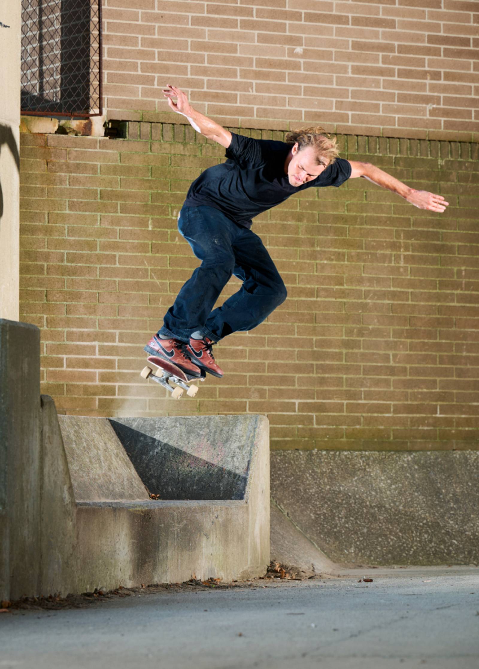
After a long winter, the Carhartt WIP Skate Team got back in the van and headed south to Atlanta – a sprawling metropolis with no shortage of highway embankments and hand rails – with photographer Ben Colen on hand to document the trip.

Last Light
The final delivery Spring/Summer 2026 unfolds in Thailand, lensed by director Bing Cao and photographer Chayanee Choedsuk. Signaling summer at its peak, heat lingers and time stretches, as scenes drift between rural stillness and the hazy glow of the city at dusk.

In All Directions
Shot by photographer Zander Taketomo across New York City, the Summer 26 collection moves through many themes and moods – from our core Icons and uniform-inspired styles to bold allover print shirts and graphic t-shirts.

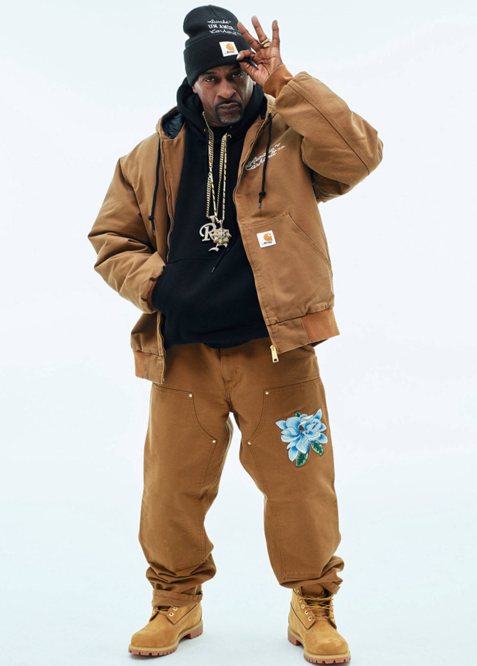
F.C.Real Bristol x Carhartt WIP
Marking their first collaboration, Carhartt WIP and Tokyo-based label F.C.Real Bristol have created a capsule collection spanning sportswear-inspired apparel, accessories and football memorabilia.

Keep It Moving
With the new season underway, Eduardo Gonçalves documents the second delivery of Spring/Summer 2026 across Lisbon, as a balmy afternoon drifts into a restless night.
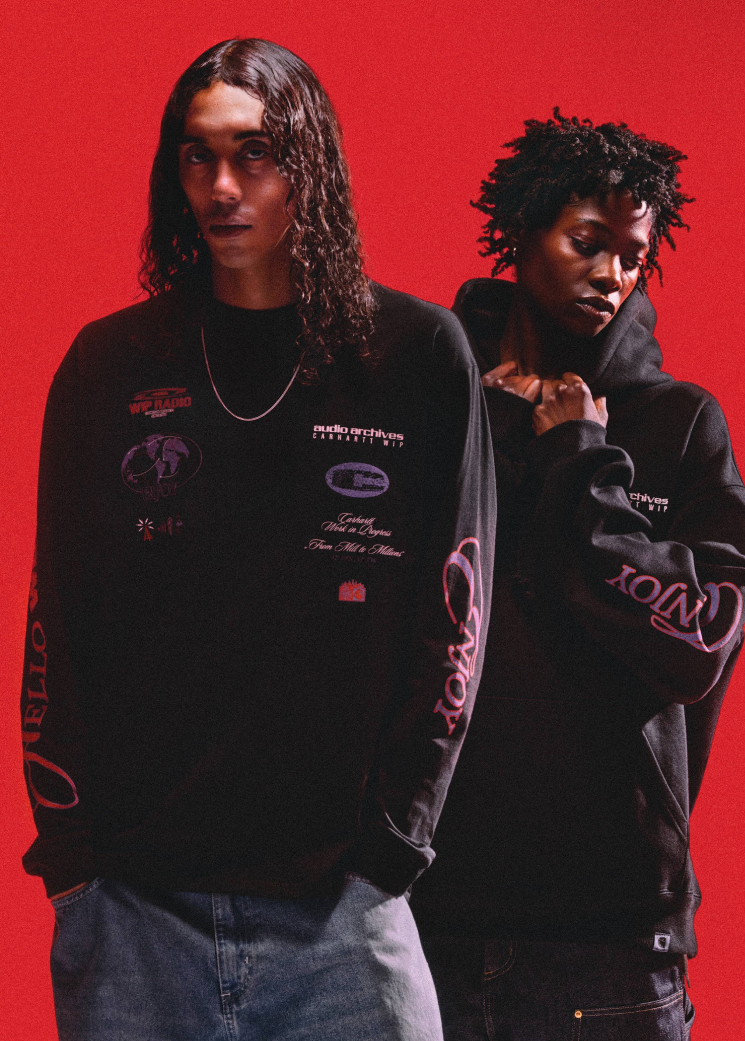
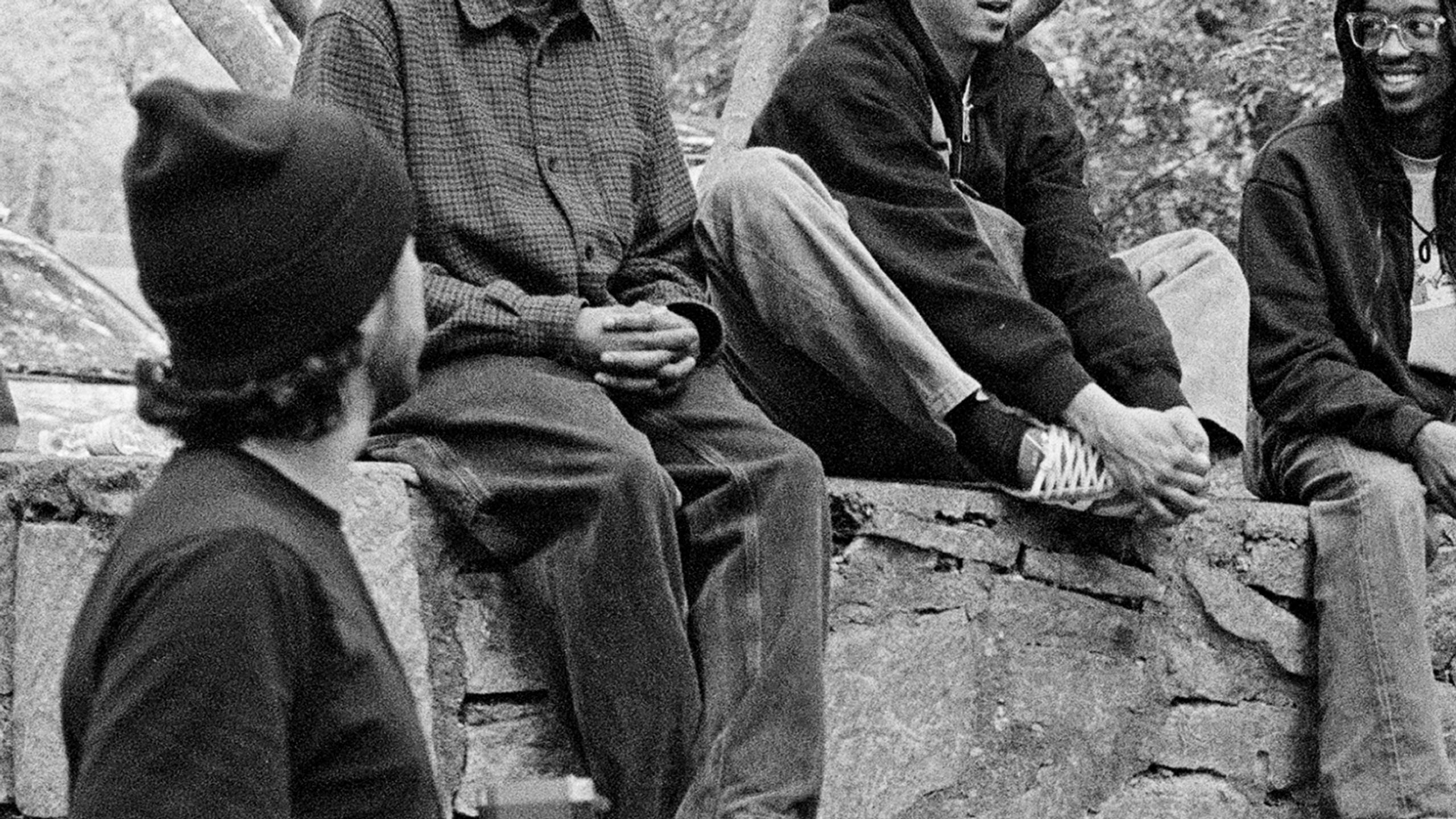
Audio Archives
Encompassing a printed publication, a capsule collection, and a global program of radio broadcasts and events, Audio Archives marks over 15 years of Carhartt WIP Radio, while paying tribute to the cultural impact of community radio today.

What makes an icon?
Icons are defined by their ability to stand the test of time. They endure – not just physically, but culturally too. They live on in our collective memory, transcending geographies and generations.

States in Between
Suspended between seasons. Winter holds firm, despite the promise of spring. Dependable pieces become all the more necessary – offering familiarity, reliability, and a buffer against unpredictable weather.
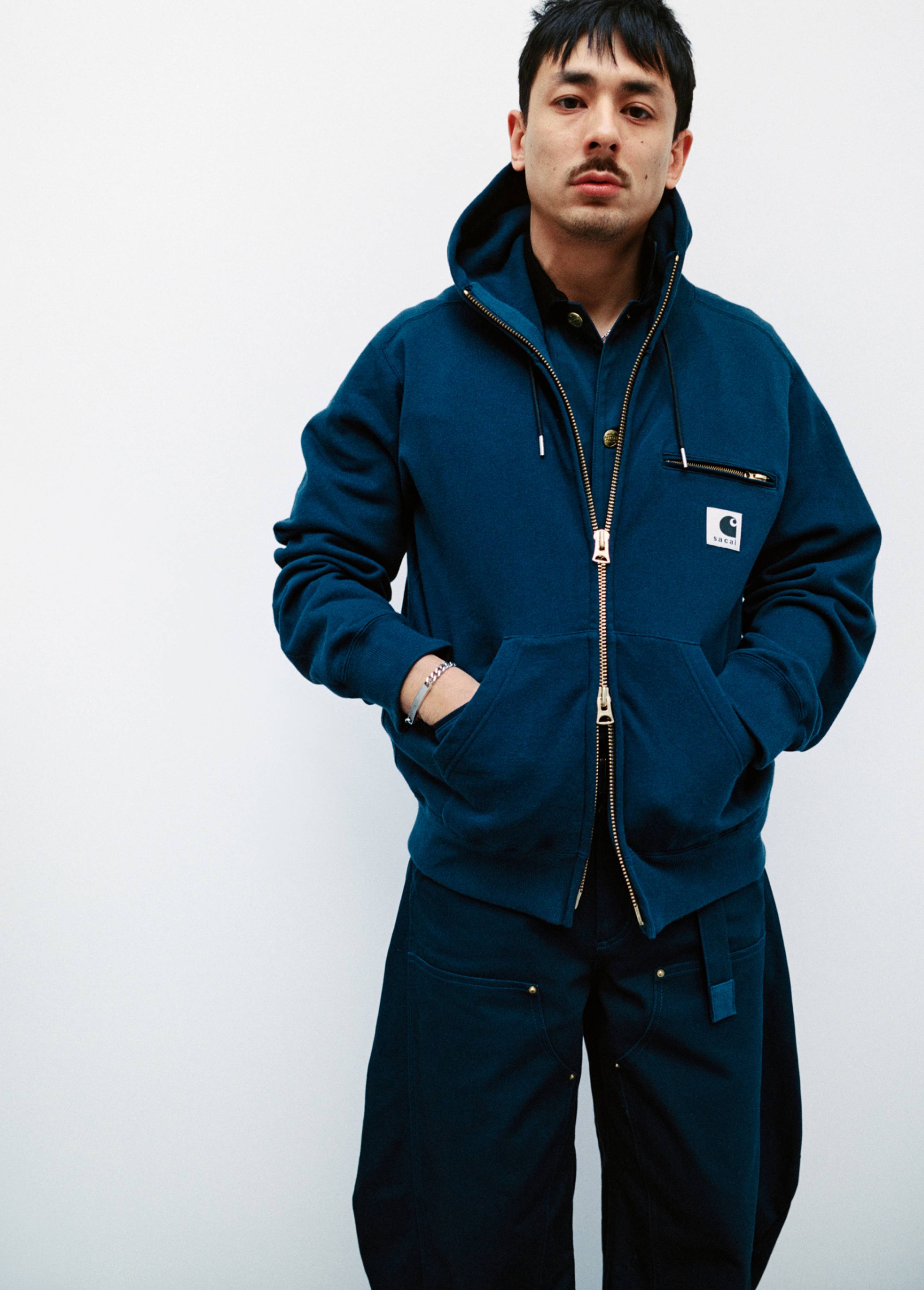
sacai x Carhartt WIP Spring/Summer 2026
The latest collection from sacai and Carhartt WIP transforms the brands’ iconic pieces through sacai’s hybridizing lens, creating new styles that fuse familiarity with reinvention.
Spring/Summer 2026 by Hugo Campan
Emerging from the depths of winter, the Spring/Summer 2026 campaign breaks through the binds of the past, as a new season comes into focus.

Label Feature: South of North
It takes one chance encounter to set a chain of events in motion. For producer, DJ, and label founder Dominik Rodemann (AKA Marathon Man), that moment came in an Amsterdam bar, where he met Dutch multi-instrumentalist Ronald Langestraat

Ishin Denshin: A Carhartt WIP Skate Film
Marking Carhartt WIP’s first full-length skate film set in Asia, Ishin Denshin takes viewers deep into Japan’s quiet corners and busy city streets. The film coincides with the expansion of Carhartt WIP’s skate team within Japan and throughout Asia.

Label Feature: Black Rave Culture
Composed of James Bangura, Nativesun and Amal, Black Rave Culture first connected in 2020 at the height of the global pandemic, as swathes of Black Lives Matter protests swept across America, and further afield.
Salomon x Carhartt WIP: The X-ALP Carhartt WIP
For Fall/Winter 2025, we have reunited with Salomon on the X-ALP Carhartt WIP, expanding on the shared values that defined our first partnership: functionality, durability, and an uncompromising commitment to performance.

SEDIMENTAL WORKS, 1975-2025
SEDIMENTAL WORKS is a special edition book examining 50 years of the Active Jacket and the culture that has formed around it.

F/W25 Store Exclusives
Grounded in the Fall/Winter 2025 collection, the Store Exclusives capsule evolves the season’s themes in its own distinct way, introducing new styles alongside familiar pieces, with updated fabrics, details, and colorways.
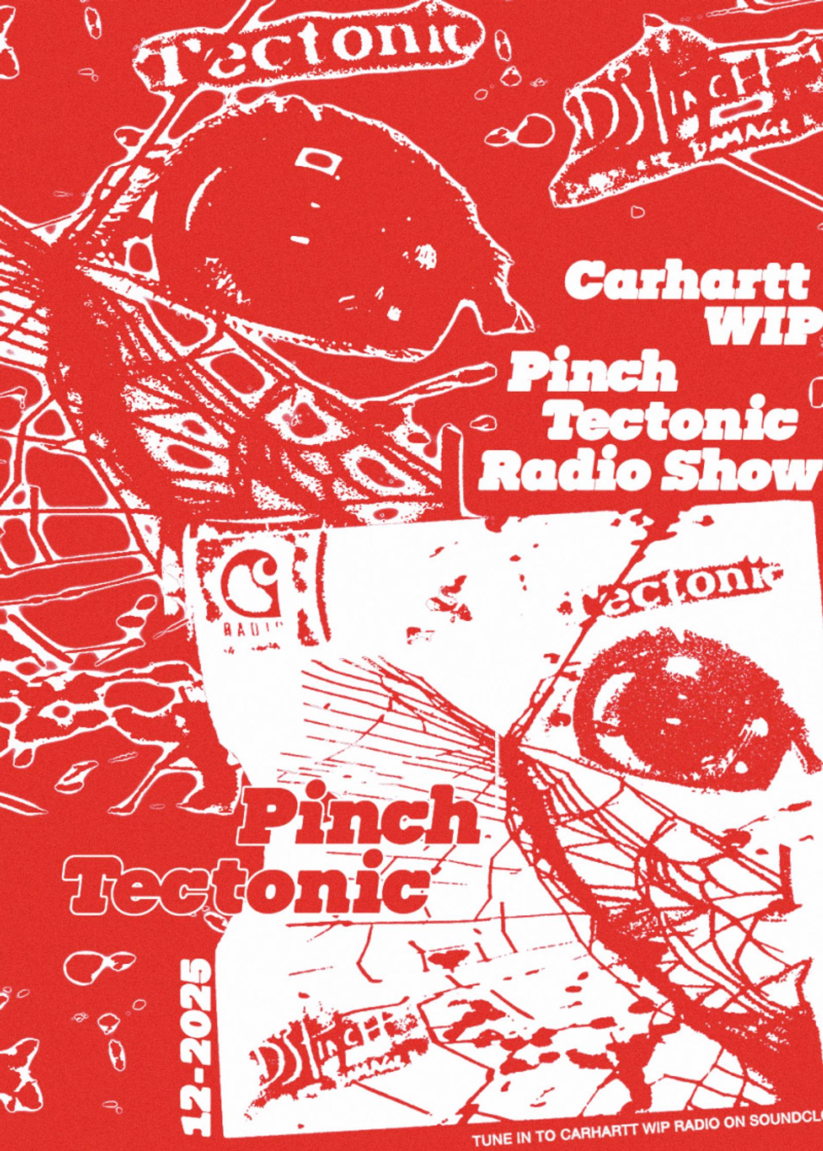
Artist Feature: Pinch/Tectonic
“Invest in the community around you and make sure you enjoy whatever journey you choose to go on with it all,” says Rob Ellis


Artist Feature: Carl Craig - Planet E
Born and raised in Detroit, Craig rose to prominence in the late 80s, becoming a leading figure in the city’s electronic music scene as part of techno’s second generation of innovators
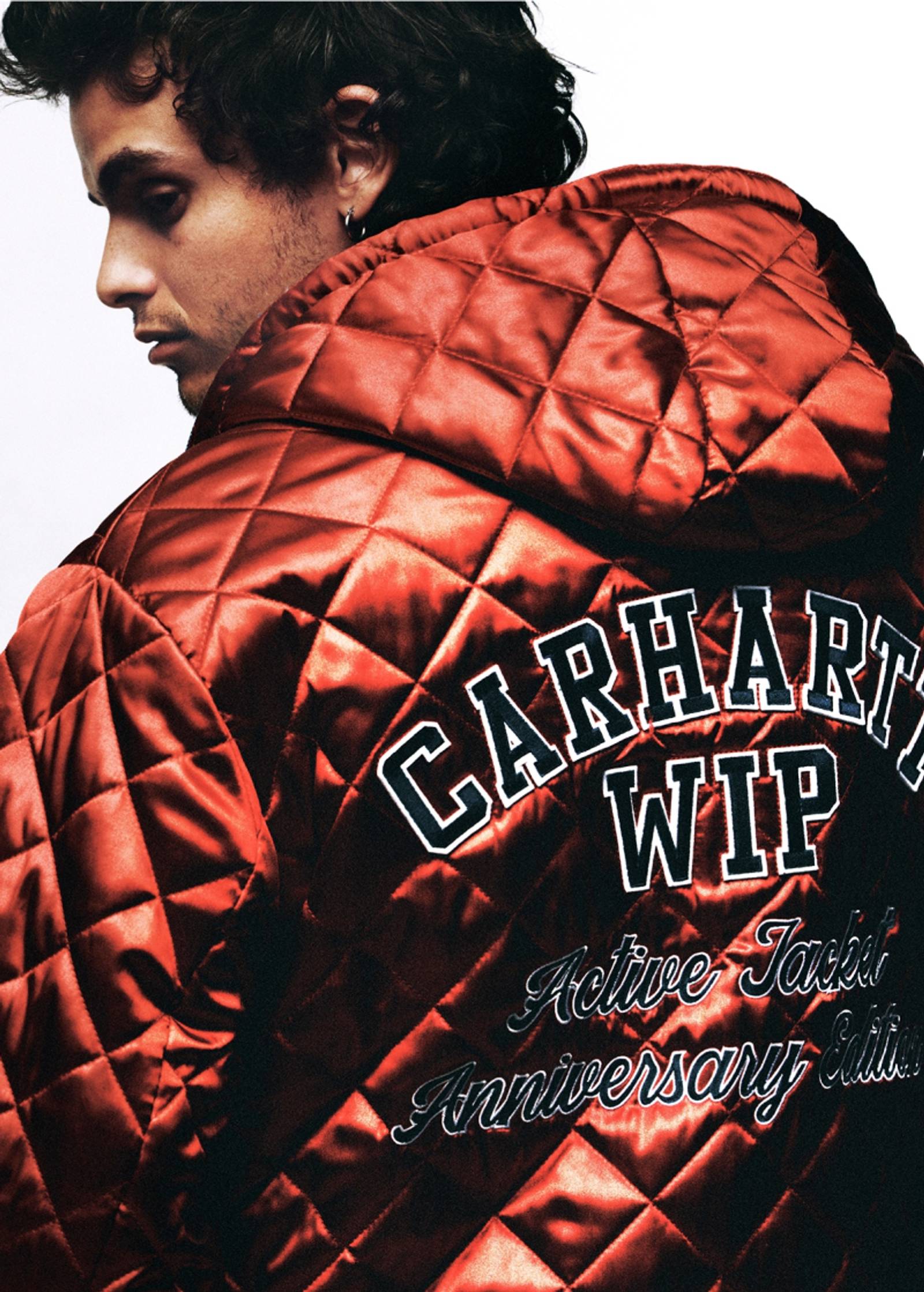
OG Active Jacket 50th Anniversary Edition
To mark 50 years of the iconic Active Jacket, we have created four special edition designs. A symbol of memory and materiality, identity and adaptation, each new style honors the original.
WIP Magazine Issue 11: Interviews
This year, WIP magazine adopted a slightly different approach in format. In addition to our familiar interview and feature sections, as well as our sprawling dossier, the issue included pages dedicated purely to images, and space composed entirely of text.
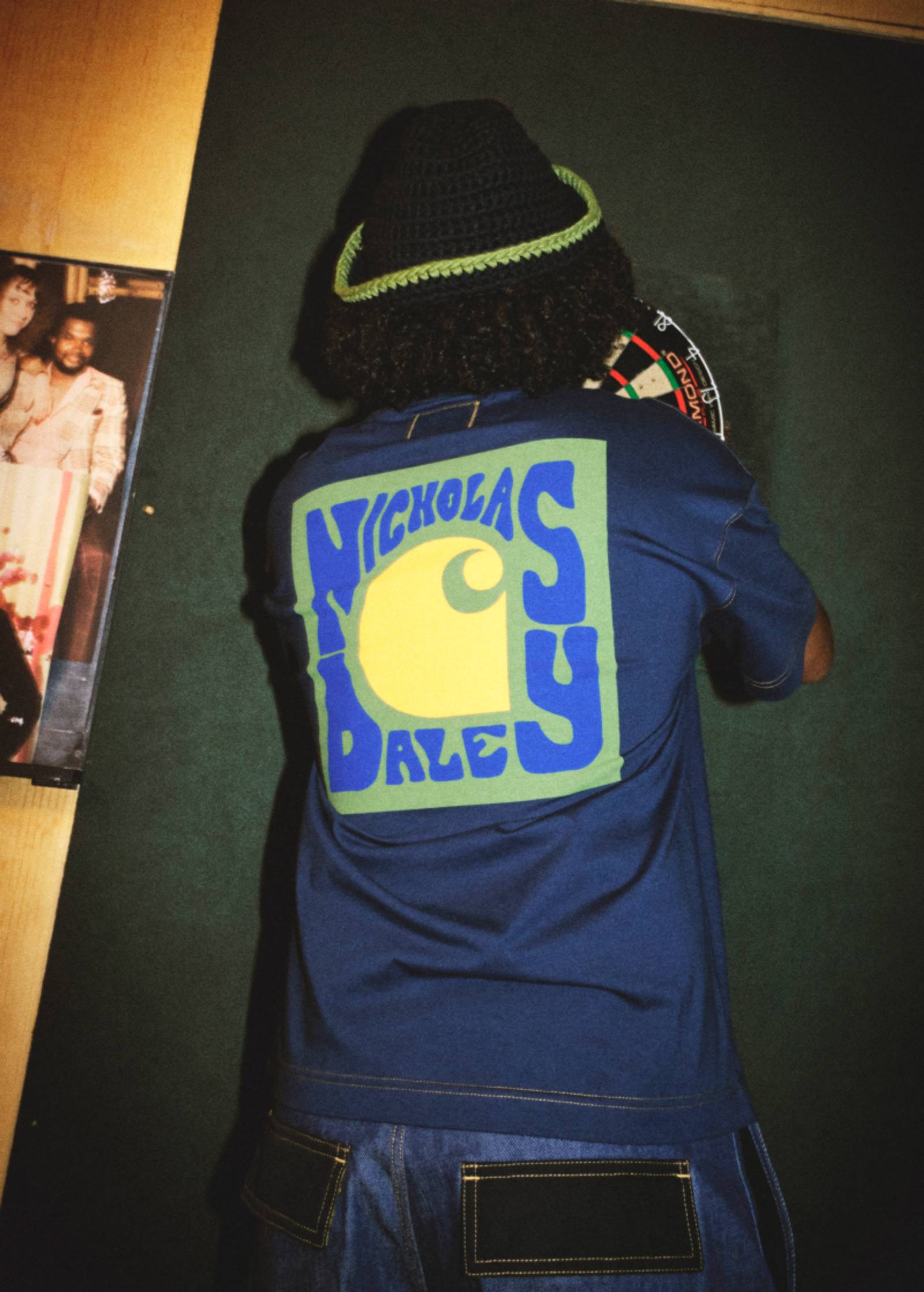
Carhartt WIP x Nicholas Daley
Built on a shared appreciation of music and the culture that surrounds it, we have collaborated with British fashion designer Nicholas Daley on a 13-piece capsule collection. The collection sees Daley pay tribute to the pioneering reggae club night created by his parents, Maureen and Jeffrey Daley.
A Decade of Discovery
Since 2014, designer-bookmaker duo Lewis Chaplin and Sarah Piegay-Espenon have been running Loose Joints, a London-born, Marseille-based multi-award winning, independent publishing house and design studio.
The Carhartt WIP Skate Team in the Motor City
Joined by photographer Ben Colen, the Carhartt WIP skate team piled into a van and set out for Detroit, Michigan, to explore the city’s evolving landscape, from the traces of its automotive past to the concrete stretches that define its present.

Léa Sen Chooses Her Own Adventure
Levels, Lobbies, and Backroom Lore: Having already garnered a glut of impressive features, on tracks by artists like Sampha and Vegyn, the French-born artist reflects on the eve of her debut album.

In the Hearts of Many by Sly Morikawa
Sly Morikawa explores contrasts and dualities, balancing tender, intimate moments with a sense of quiet composure, mirrored in our Fall/Winter 2025 collection.

Label Feature: SPE:C
This month’s show is brought to you by Berlin-based producer, DJ, and label founder Darwin.

sacai x Carhartt WIP Fall/Winter 2025
Our third collaboration with sacai reinterprets our most iconic items through sacai’s distinctive design lens. The result is a 19-piece capsule collection that embodies the unique DNA of both brands, while elevating familiar archetypes.

Solovair x Carhartt WIP
For Fall/Winter 2025, Carhartt WIP has collaborated with Solovair, the heritage British shoe brand, to create three exclusive, handmade leather styles.

MIKE: Artist of the Century
Our first encounter with MIKE, the ascendent 27-year-old rapper, took place in late February at his NYC apartment, as he sat down to discuss his new album, Showbiz!, and his forthcoming European tour.

To walk among giants
New monstrous mascots – including a giant duck, a wild dog, and an electric boogeyman – appear across a selection of items for Fall 25. Explore the first delivery in store and online.

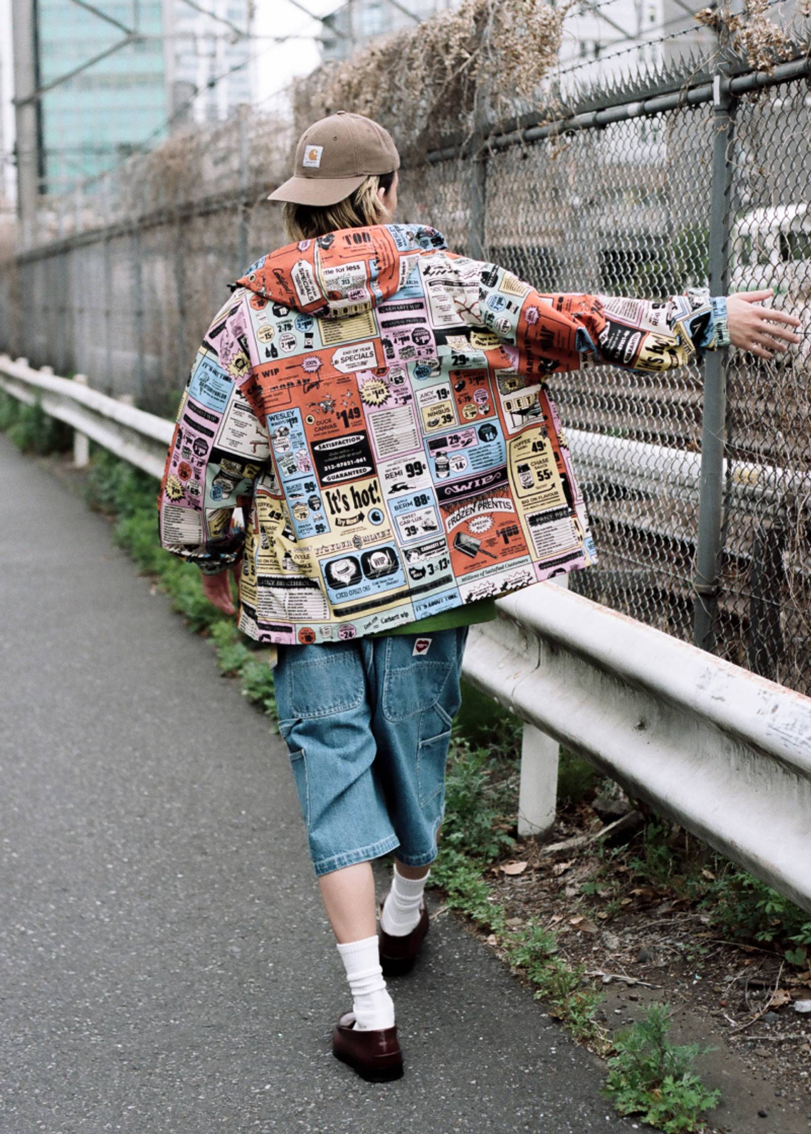
A Bridge Between Two Worlds
Photographer Chris Currence situates the Fall/Winter 2025 collection on a New York peninsula, caught between two worlds, as each piece embodies a sense of transition, bridging one season to the next.
Fall 2025
Our Fall 2025 campaign offers a cinematic shift in perspective, while reaffirming these core tenets. Shot in Atlanta by Daniel Derro Regan, with art direction from Ben Dorado, a series of vignettes and images reflect ideas around labor and living, situated in a city that has become an epicenter of cultural production and influence over the past decade.
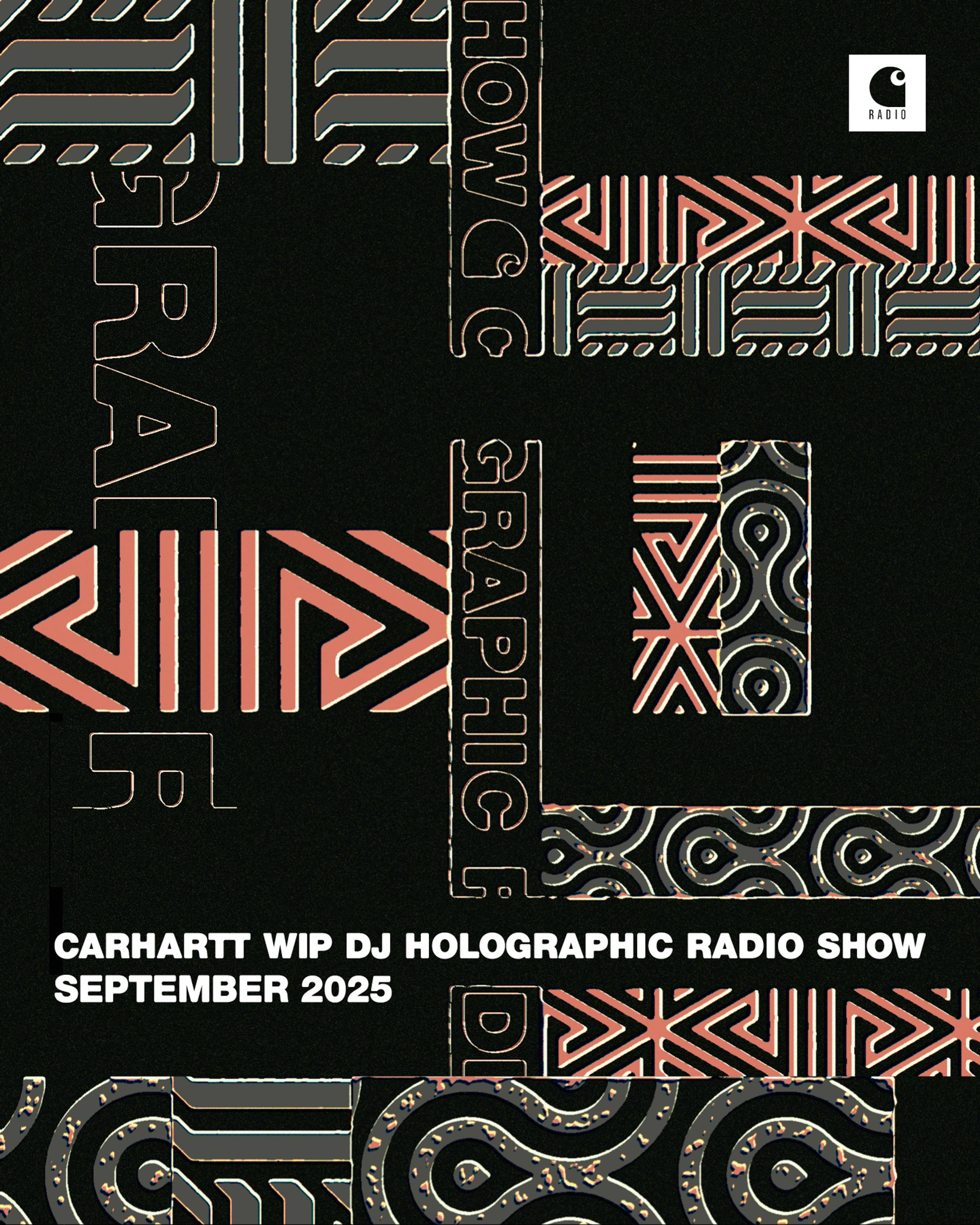
Artist Feature: DJ Holographic
This month’s show features Detroit’s DJ Holographic, whose work combines elements of house, disco and R&B with the musical heritage of her hometown, namely techno and Motown.

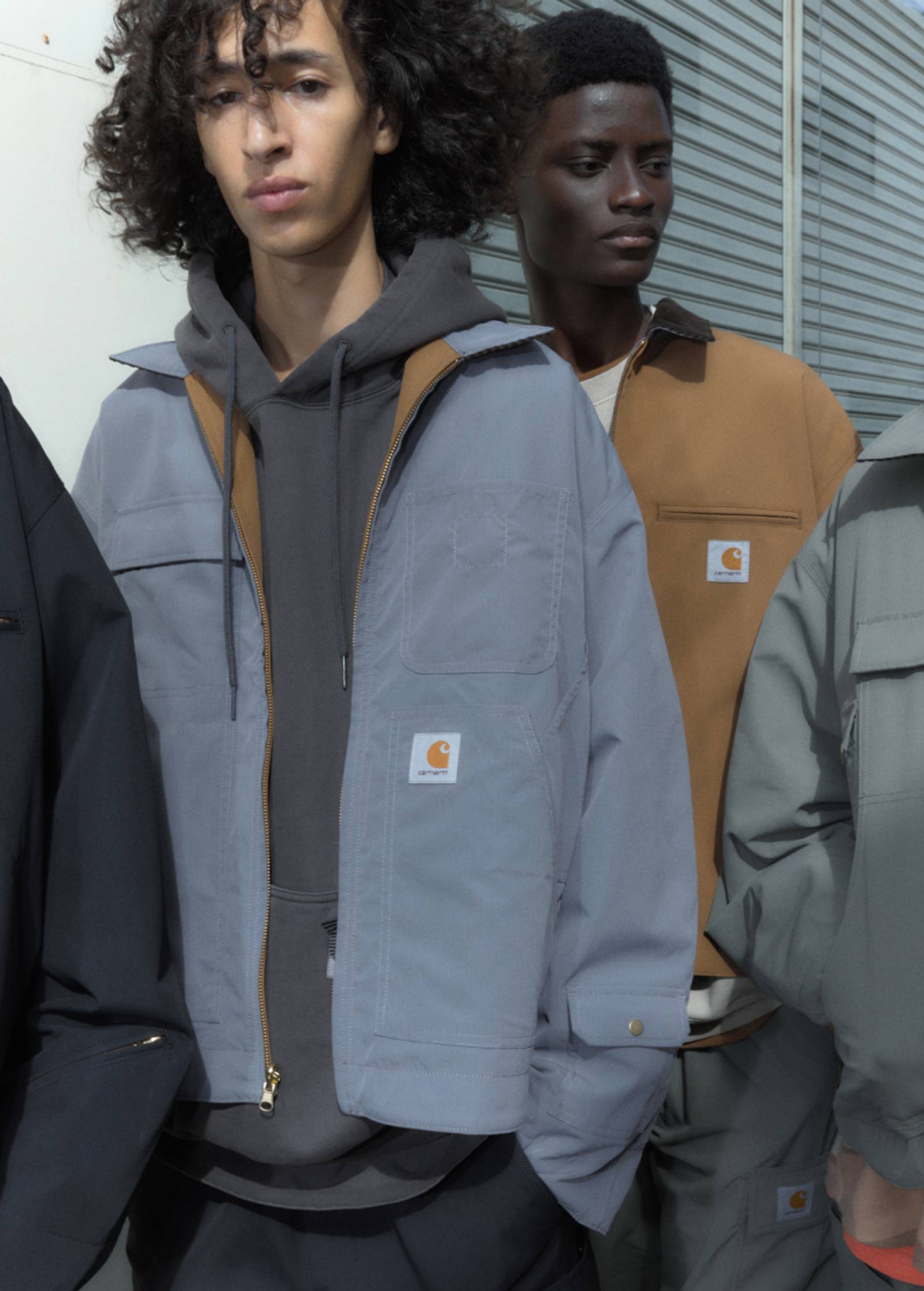
Fall/Winter 2025: Icons
You know our Icons as reliable, robust, and versatile – qualities that have endured since day one. You have seen them withstand time and trend, transcending context and cultures.

Artist Feature: Infinity Knives & Brian Ennals
For this month’s episode of Carhartt WIP Radio, the duo created a mix featuring numerous collaborative works, old and new. Alongside it is an interview with Ennals, who talks about being a misanthrope, the role of humor in his lyrics, and what made the new album so “acidic.

WIP Magazine Issue 11
Returning for Spring/Summer 2025, the latest issue of WIP Magazine is built around the idea of tangible culture.

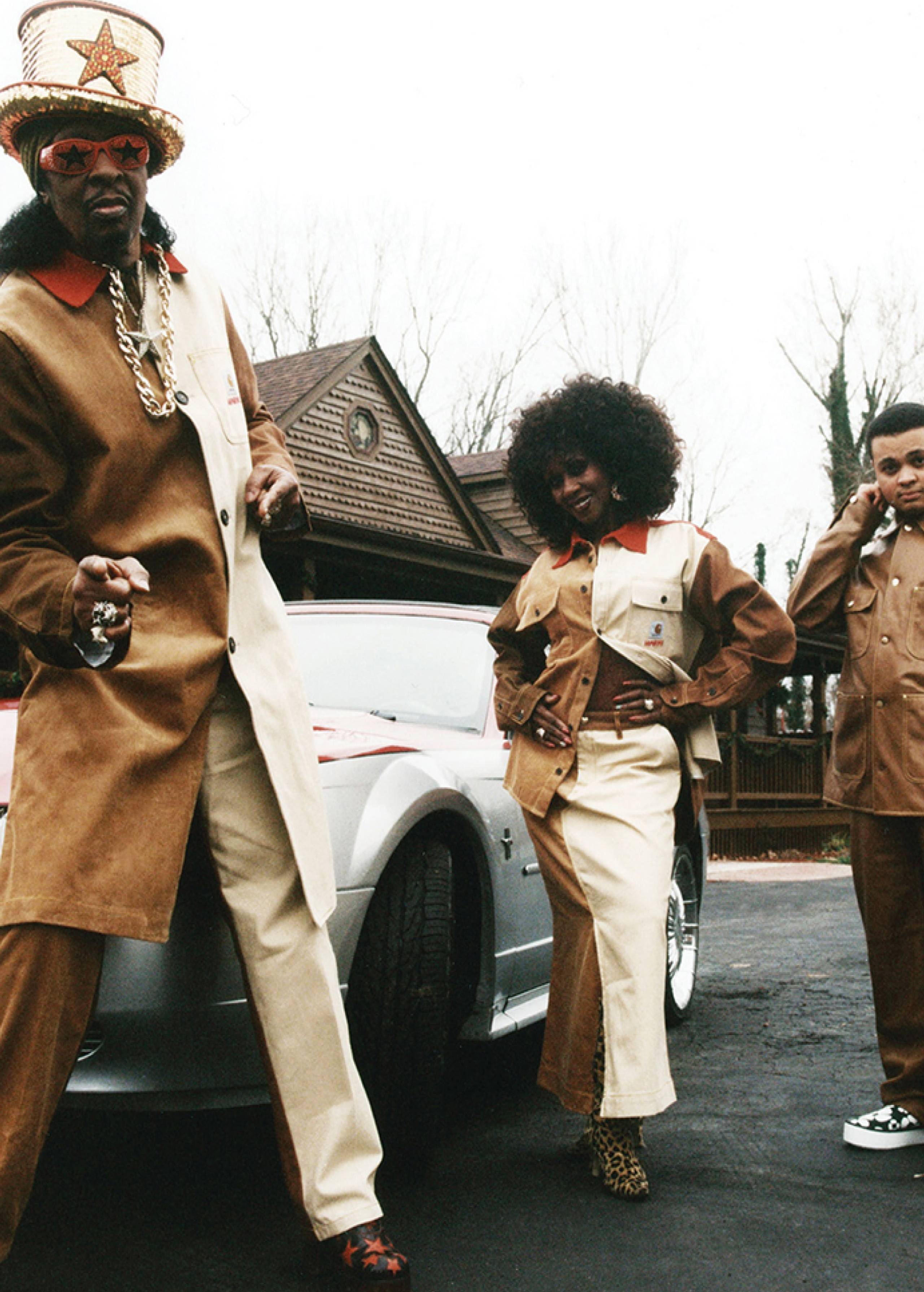
CLIPSE Engineered by Carhartt WIP
Iconic Virginia hip-hop duo CLIPSE have collaborated with Carhartt WIP on an exclusive capsule collection, celebrating the release of their new album – Let God Sort Em Out – and forthcoming global tour.

Carhartt WIP x Quartersnacks: ‘Snacks in Progress’
Following on from our 2022 capsule collaboration, we have reunited with New York-based skate media platform Quartersnacks.
S/S25 Store Exclusives
This season’s Store Exclusives capsule explores key elements from the Spring/Summer 2025 collection.
Carhartt WIP x INVINCIBLE® with Shinsuke Nakada: ‘Remake’
For Fall/Winter 2024, Carhartt WIP joins forces once again with the brand and retailer INVINCIBLE®.
Shiningmaker
WIP magazine travels to Taiwan to visit 27-year-old jewelry designer Eric Wu, who launched his grillz studio Shiningmaker in 2021.
Carhartt WIP x TRESOR: A Techno Alliance
Carhartt WIP – whose music roots can be traced to Detroit, Michigan – joins forces with the Berlin-based club, record label and cultural institution Tresor.
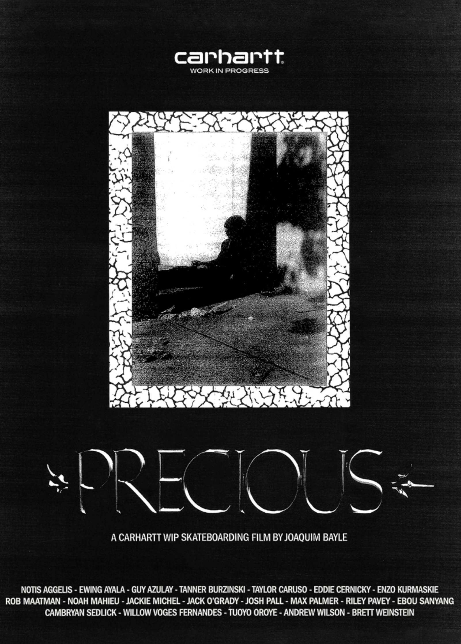
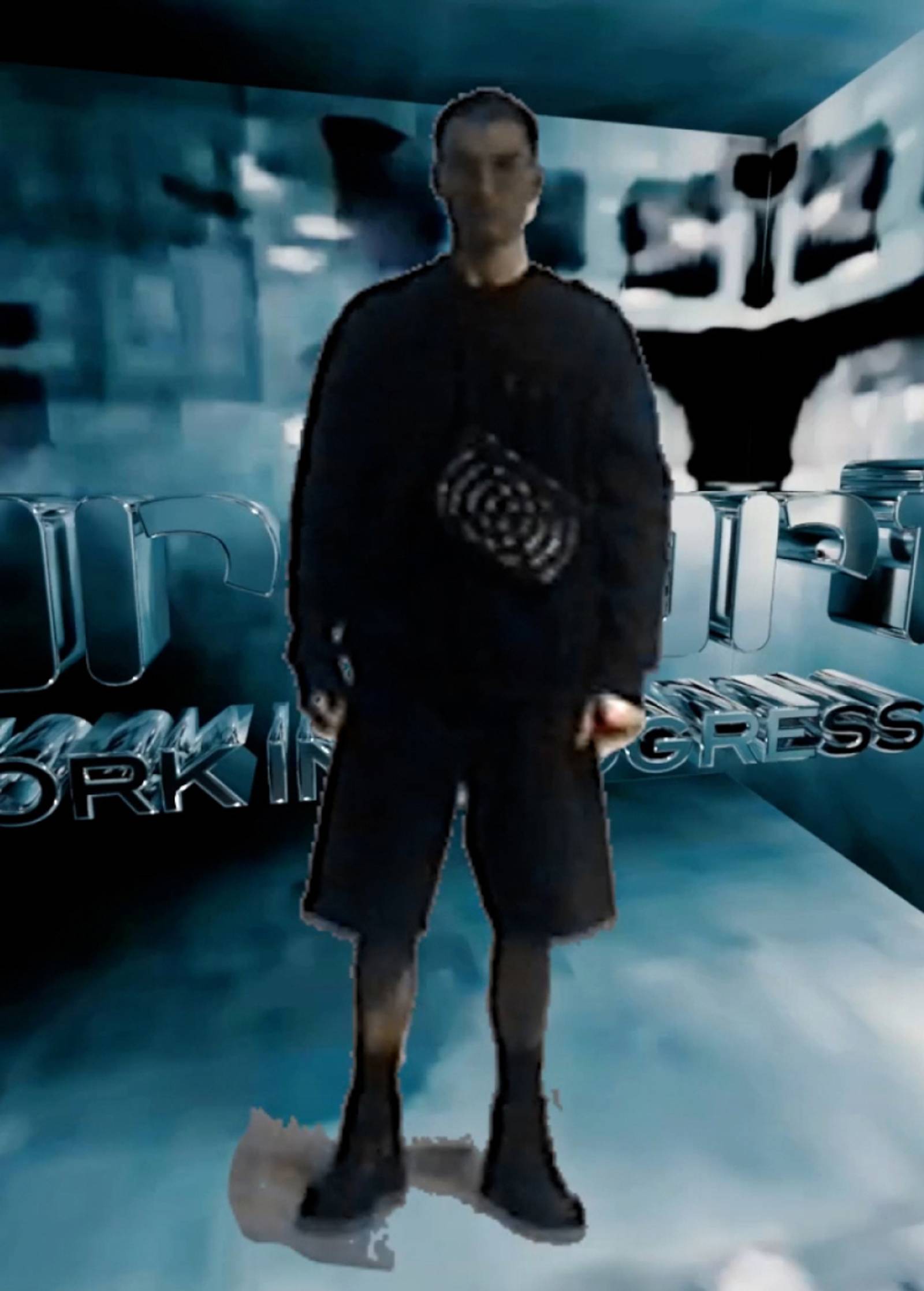
PRECIOUS: a skate film by Joaquim Bayle
Directed by Paris-based filmmaker Joaquim Bayle, PRECIOUS builds on Carhartt WIP’s last full-length skate project INSIDE OUT, which was released in 2022.
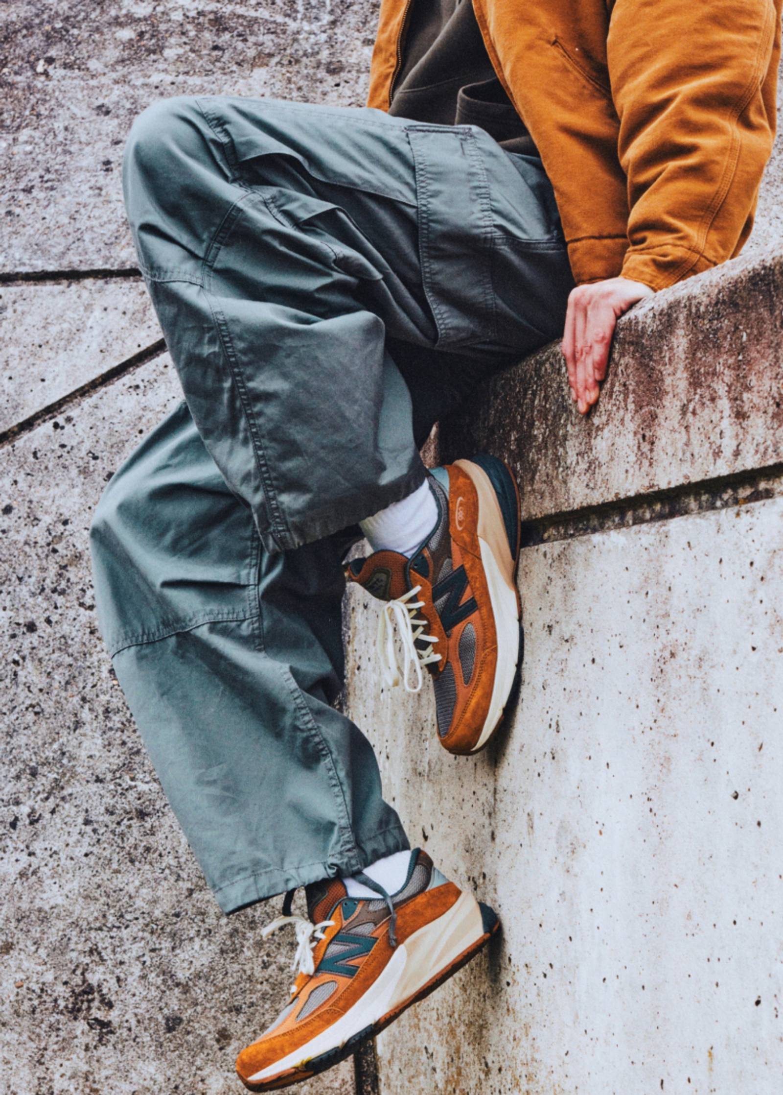
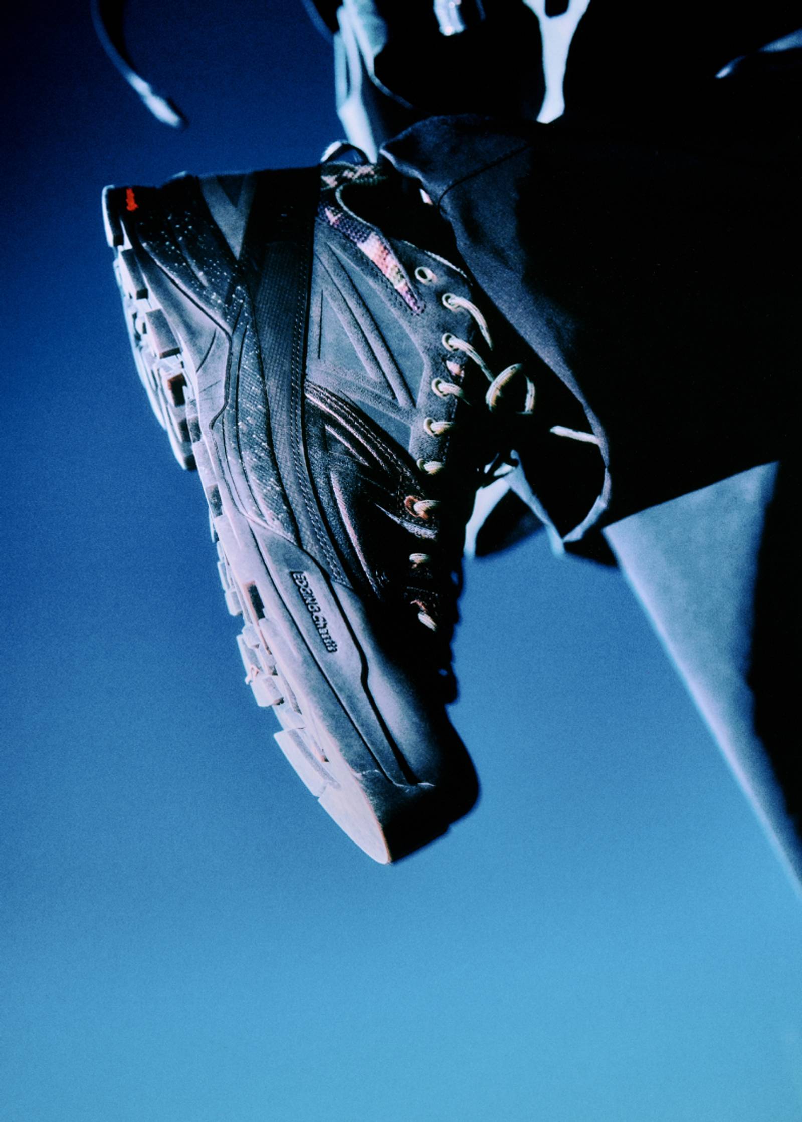
Carhartt WIP x New Balance MADE in USA 990v6
A collaborative version of the MADE in USA 990v6 celebrates a shared history of creating iconic originals.
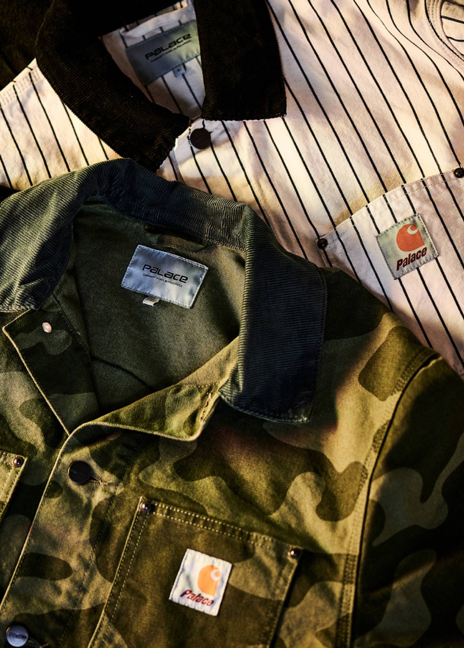
Palace Carhartt WIP
Palace and Carhartt WIP announce their first ever collaboration on a line of heavy-duty work inspired apparel.
Carhartt WIP x Awake NY
For Spring/Summer 2023, Carhartt WIP has once again collaborated with Awake NY to create an eight-piece capsule collection.
MARNI x Carhartt WIP
The artistic, color-savvy world of MARNI meets Carhartt WIP for the first time, offering an original point of view on contemporary daywear through a wardrobe rooted in utilitarian silhouettes
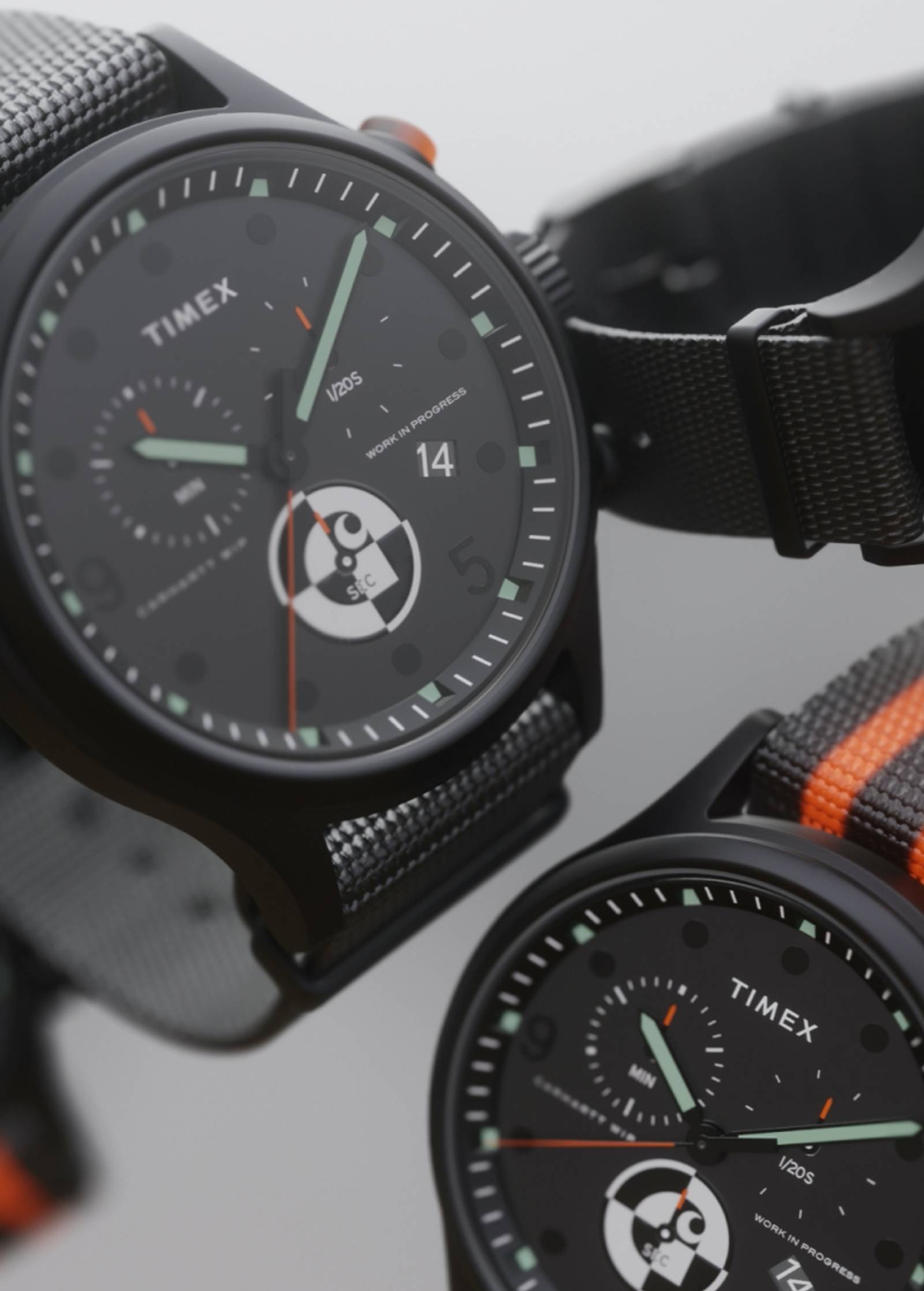
Timex x Carhartt WIP
For Fall/Winter 2021, Carhartt WIP has collaborated with Timex, continuing an ongoing partnership, based on timeless, utilitarian style.
F/W21: Reworked
This week’s product edit features garments that take inspiration from our most iconic styles, while also offering experimental interpretations of them.
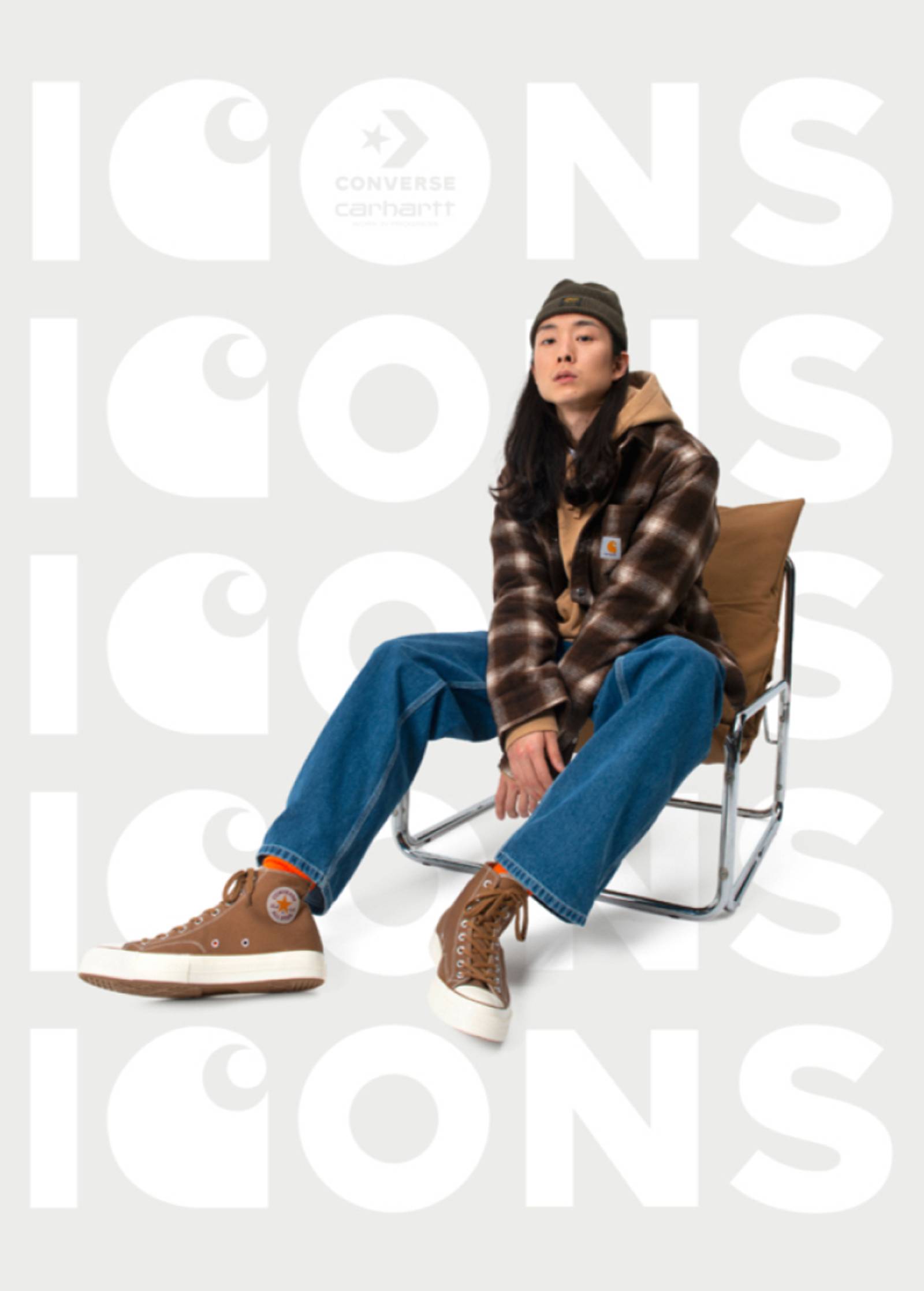
Carhartt WIP x Converse Chuck 70 Hi ICONS
The latest installment of the ongoing partnership between Carhartt WIP and Converse.
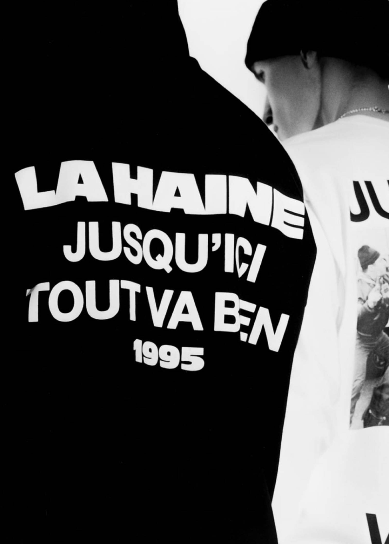
Carhartt WIP for La Haine 25th Anniversary
Carhartt WIP for La Haine 25th Anniversary is now live, available exclusively from both our online shop and select Carhartt WIP stores.

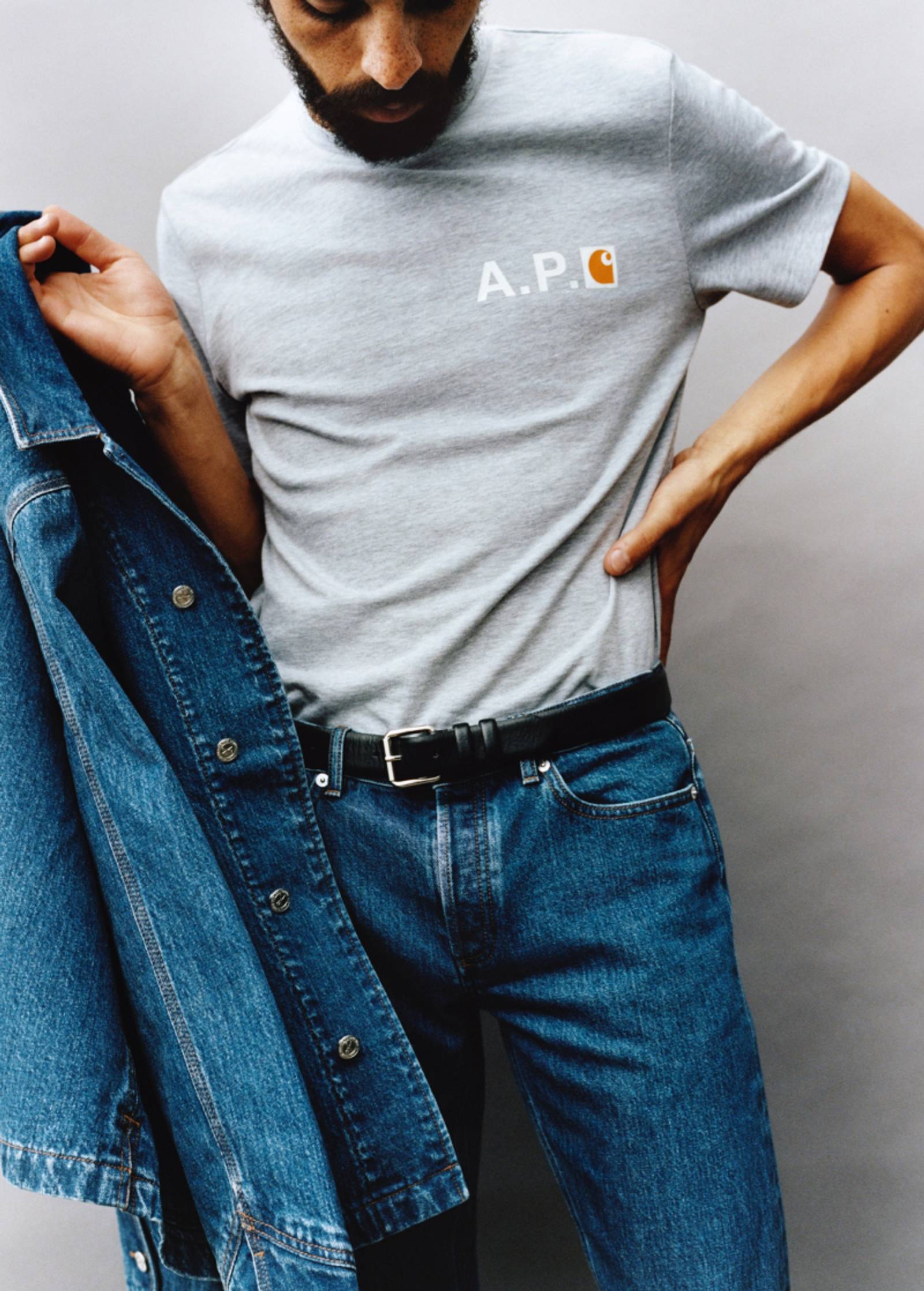
A.P.C. x Carhartt WIP
The collection features iconic Carhartt WIP pieces, which have been reinterpreted by the Paris-based brand and executed in its own fabrics.

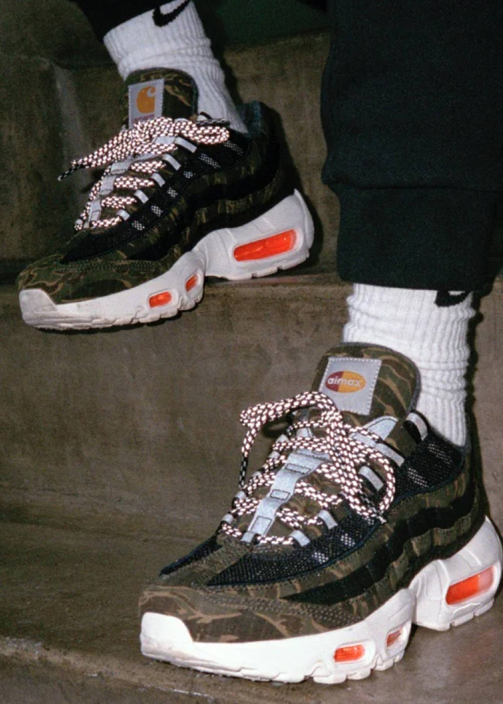
Nike x Carhartt WIP
For the first time, Carhartt WIP and Nike have joined forces, creating a footwear collection that combines the unique aesthetic of both brands.
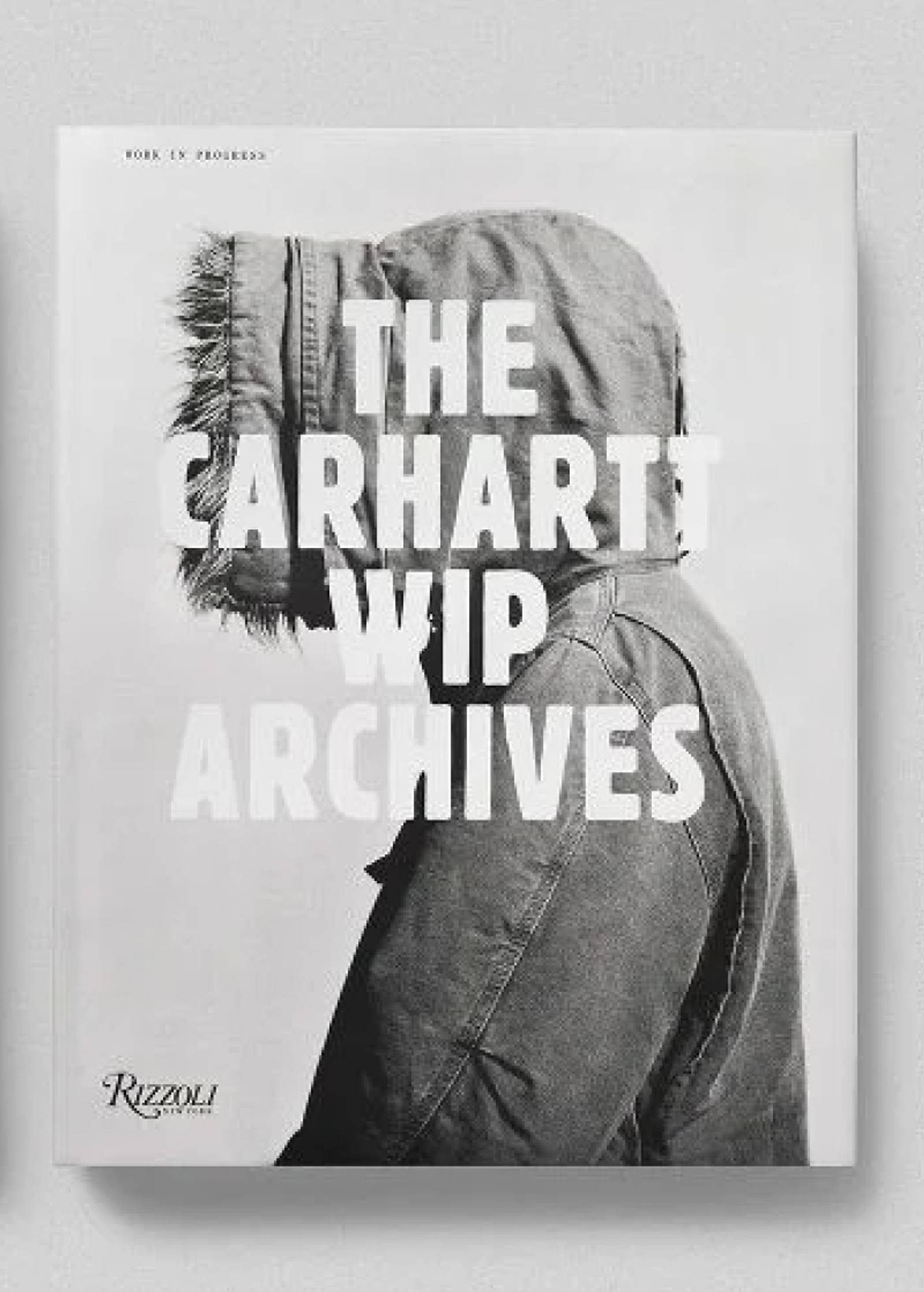
The Carhartt WIP Archives
Back in the eighties, when the Western world was deluged by a wave of blue denim, Carhartt’s brown duck work coats entered the streets as an antidote. Soon after, the American workwear classic would spawn Carhartt WIP.